Search Widget
The Intufind search widget provides AI-powered semantic search for your website. It understands natural language queries and finds relevant products and content.
Quick Start
Add the search widget to any page with a single script tag:
<script
  src="https://cdn.intufind.com/search-loader.js"
  data-publishable-key="if_pk_your_key_here"
  data-workspace-id="your_workspace_id"
></script>
You'll find your ready-to-copy embed snippet in the Intufind Dashboard — go to your workspace's Search Widget tab, where your publishable key and workspace ID are pre-filled.
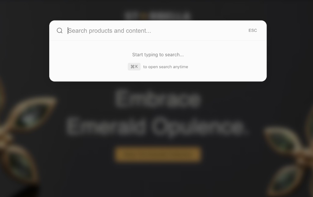
By default, the search opens with Cmd+K (Mac) or Ctrl+K (Windows/Linux).
Installation Methods
Script Tag (Recommended)
Add before </body>:
<script
  src="https://cdn.intufind.com/search-loader.js"
  data-publishable-key="if_pk_xxx"
  data-workspace-id="your_workspace_id"
></script>
With Data Attributes
Configure via data attributes:
<script
  src="https://cdn.intufind.com/search-loader.js"
  data-publishable-key="if_pk_xxx"
  data-search-products="true"
  data-search-posts="true"
  data-product-limit="6"
  data-post-limit="4"
  data-include-facets="true"
  data-show-trigger="false"
></script>
Configuration Object
For more options:
<script>
  window.intufindSearchConfig = {
    publishableKey: 'if_pk_xxx',
    searchProducts: true,
    searchPosts: true,
    productLimit: 6,
    postLimit: 4,
    includeFacets: true,
    facetFields: ['categories', 'brands', 'price_ranges'],
  };
</script>
<script src="https://cdn.intufind.com/search-loader.js"></script>
Configuration Options
API Settings
| Option | Type | Default | Description |
|---|---|---|---|
publishableKey | string | required | Your Intufind publishable key |
workspaceId | string | auto | Workspace ID (auto-derived from hostname) |
Search Settings
| Option | Type | Default | Description |
|---|---|---|---|
searchProducts | boolean | true | Enable product search |
searchPosts | boolean | true | Enable post/content search |
productLimit | number | 6 | Maximum product results |
postLimit | number | 4 | Maximum post results |
Facets
| Option | Type | Default | Description |
|---|---|---|---|
includeFacets | boolean | true | Include facet filters |
facetFields | string[] | ['categories', 'brands', 'price_ranges'] | Facet fields to display |
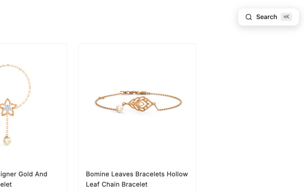
Trigger Button
| Option | Type | Default | Description |
|---|---|---|---|
showTrigger | boolean | false | Show a visible trigger button |
triggerPosition | string | 'top-right' | 'top-right', 'top-left', 'bottom-right', 'bottom-left' |
Behavior
| Option | Type | Default | Description |
|---|---|---|---|
closeOnSelect | boolean | true | Close when result is clicked |
closeOnEscape | boolean | true | Close on Escape key |
autoFocus | boolean | true | Auto-focus input when opened |
keyboardShortcut | string | 'k' | Keyboard shortcut key (used with Cmd/Ctrl) |
Debug
| Option | Type | Default | Description |
|---|---|---|---|
debugMode | boolean | false | Enable debug logging |
JavaScript API
The widget exposes a global API at window.IntufindSearch:
Control Methods
// Open search overlay
window.IntufindSearch.open();

// Close search overlay
window.IntufindSearch.close();

// Toggle overlay
window.IntufindSearch.toggle();

// Check if open
const isOpen = window.IntufindSearch.isOpen();

// Open with a pre-filled query
window.IntufindSearch.search('running shoes');
Configuration Methods
// Get current configuration
const config = window.IntufindSearch.getConfig();

// Update configuration
window.IntufindSearch.configure({
  productLimit: 10,
  searchPosts: false,
});

// Get full state
const state = window.IntufindSearch.getState();
// Returns: { isOpen: boolean, config: SearchWidgetConfig }

// Check if initialized
const ready = window.IntufindSearch.isInitialized();

// Get version
const version = window.IntufindSearch.version;
Theme Methods
// Update theme
window.IntufindSearch.setTheme({
  primaryColor: '#6101fe',
  modal: { background: '#1a1a1a' },
});

// Set custom CSS
window.IntufindSearch.setCustomCSS(`
  .itf-search-modal { border-radius: 24px; }
`);
Cleanup
// Remove widget from page
window.IntufindSearch.destroy();
Custom Trigger Button
Instead of the default Cmd+K, you can create your own trigger:
<button onclick="window.IntufindSearch.open()">
  Search products...
</button>

<script
  src="https://cdn.intufind.com/search-loader.js"
  data-publishable-key="if_pk_xxx"
  data-show-trigger="false"
></script>
Or use the built-in trigger button:
<script
  src="https://cdn.intufind.com/search-loader.js"
  data-publishable-key="if_pk_xxx"
  data-show-trigger="true"
  data-trigger-position="top-right"
></script>
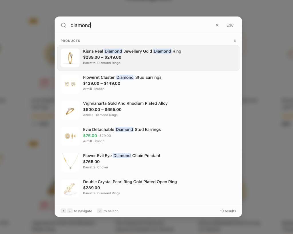
Search Results
Product Cards
Product results display:
- Product image with fallback
- Title with search term highlighting
- Price (regular and sale)
- Star rating and review count
- Brand name
- Categories (up to 2)
- Stock status indicator
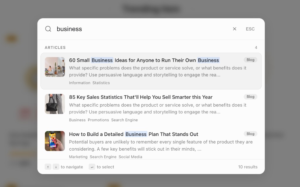
Post Cards
Post/content results display:
- Featured image with fallback
- Title with highlighting
- Content excerpt (150 characters)
- Post type badge (Blog, Page, Docs, etc.)
- Categories (up to 3)
Facet Filters
When includeFacets is enabled, the widget shows filter chips:
window.intufindSearchConfig = {
  publishableKey: 'if_pk_xxx',
  includeFacets: true,
  facetFields: ['categories', 'brands', 'price_ranges'],
};
Features:
- Dynamic facets based on search results
- Multi-select within each facet
- Document count per option
- "Clear" button when filters are active
- Up to 5 options shown per facet
Keyboard Navigation
| Key | Action |
|---|---|
Cmd/Ctrl + K | Open search |
↑ / ↓ | Navigate results |
Enter | Select highlighted result |
Escape | Close search |
keyboardShortcut option. For example, set it to '/' for slash-to-search like GitHub.Theming
Quick Theme
window.IntufindSearch.setTheme({
  colorScheme: 'dark', // 'light', 'dark', or 'auto'
  primaryColor: '#6101fe',
});
Full Theme Options
window.IntufindSearch.setTheme({
  colorScheme: 'auto',

  // Primary colors
  primaryColor: '#6101fe',
  darkPrimaryColor: '#8b5cf6',

  // Overlay
  overlay: {
    background: 'rgba(0, 0, 0, 0.7)',
    blur: '12px',
  },

  // Modal
  modal: {
    background: '#0a0a0a',
    border: 'rgba(255, 255, 255, 0.1)',
    borderRadius: '20px',
    shadow: '0 20px 60px rgba(0,0,0,0.3)',
    maxWidth: '800px',
  },

  // Input
  input: {
    background: '#1a1a1a',
    text: '#ffffff',
    placeholder: 'rgba(255, 255, 255, 0.4)',
    border: 'rgba(255, 255, 255, 0.1)',
  },

  // Results
  results: {
    background: 'transparent',
    hoverBackground: 'rgba(255, 255, 255, 0.08)',
    selectedBackground: 'rgba(255, 255, 255, 0.12)',
    text: '#ffffff',
    secondaryText: 'rgba(255, 255, 255, 0.5)',
  },

  // Search highlighting
  highlight: {
    color: '#ffffff',
    background: 'rgba(97, 1, 254, 0.3)',
  },

  // Facet filters
  facets: {
    chipBackground: 'rgba(255, 255, 255, 0.08)',
    chipActiveBackground: '#6101fe',
    chipText: 'rgba(255, 255, 255, 0.6)',
    chipActiveText: '#ffffff',
  },
});
See Widget Styling for more customization options.
UI States
The widget handles various states:
| State | Display |
|---|---|
| Empty | "Start typing to search..." with keyboard hint |
| Loading | Spinner animation |
| Results | Products and posts grouped with counts |
| No results | "No results found" message |
| Error | Error message with retry option |
Accessibility
The search widget is fully accessible:
- ARIA labels and roles
- Full keyboard navigation
- Focus management (focus trapped in modal)
- Screen reader announcements
- Semantic HTML structure
- High contrast support
Browser Support
| Browser | Supported |
|---|---|
| Chrome | ✓ |
| Firefox | ✓ |
| Safari | ✓ |
| Edge | ✓ |
| Mobile Chrome | ✓ |
| Mobile Safari | ✓ |
Troubleshooting
Search not opening
- Check that
Cmd+K/Ctrl+Kisn't captured by another app - Verify the script loaded (check Network tab)
- Look for JavaScript errors in console
No search results
- Verify content is synced in the Dashboard
- Check that
searchProductsand/orsearchPostsare enabled - Try a broader search term
Results not clickable
- Check for CSS conflicts (z-index issues)
- Verify result URLs are correct in your synced content
- Check console for JavaScript errors
Facets not showing
- Ensure
includeFacets: trueis set - Verify you have facet data (categories, brands, etc.) in your content
- Check that
facetFieldsincludes the fields you want
Next Steps
- Chat Widget — Add AI-powered chat
- Widget Styling — Customize the look and feel
- Framework Integration — React, Vue, and Next.js guides